Sunday, January 30, 2011

urban industrial shelves

our living room is a long narrow space, as you can see in our home tour. we've struggled to find the right wall arrangement that will house our tv, components, and, obviously, be eye candy. the layout of the room makes it the only thoroughfare from the front door to the rest of the house.

[the blank wall]

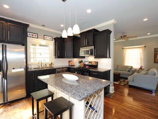
[original listing pic - not our furniture]
we found a few units we liked, but the dimensions + price tag just weren't right. like these from Crate & Barrel ($2,600):

[fulton components from crate & barrel]


months and months ago we stumbled across this look from apartment therapy and both really liked it. i loved the understated simplicity of the shelves + cricket loved the mixing of reclaimed wood with galvanized pipe to achieve a modern/urban feel. they weren't too modern for me, which is sometimes the case with cricket's first picks. and it wasn't too traditional for him, which is often the case with my selections. we both loved the idea of bringing something old into our home and wanted to stick with the reclaimed lumber vs using new boards.

since finding the inspiration, we designed a wall unit to suit our needs + space.

[the plan]

we've been on the hunt for the right wood. we needed boards at least 12" deep to hold our media components, and that proved tough--and COSTLY. we wanted them 1.5" thick and needed a few boards at least 8' long to span the entire wall. every vendor we found was going to charge us an arm + leg and it was way out of the budget. so we tabled the project until we could find it.

in the meantime, we started talking to one of cricket's family friends about custom building a china hutch for us. lee does custom cabinetry + is incredibly talented. cricket asked him if had any ideas for finding reclaimed wood, and well, low and behold....lee had a 100+ year old beam hanging out at his workshop. go figure.

the douglas fir beam came from a factory in either maryland or virginia and may date pre-civil war. a builder was storing it at lee's shop, but went under and left the beam with lee. so, lee planed down the beam to fit our specs and even gave us some of his custom stain--which is GORGEOUS.

[original douglas fir board: 12"w x 84"l]


[custom stain in an oj jug: shake well]

we (by "we" i mean cricket) went to work sanding, staining, + assembling the shelves. for legs, we used 1/2" diameter cast iron pipe and floor flanges. floor flanges don't always come in black (since it's usually used for gaslines + gaslines don't typically attach to a floor), so we went with the galvanized silver flanges + spray painted them a flat black. to make sure the cast iron pipe matched the finish, we gave the pipes a spray of flat black too. also, we learned that black wood screws ain't cheap. so we fashioned our own by pushing the screws into a cardboard box for a quick spray of flat black.


[we had to spray paint the flanges because the black ones are hard to find]

[an assembled "leg": this one is a 10" pipe for the base]

[again, we spraypainted regular screws because black wood screws are pricey]

once the pipe-and-flange legs were assembled, we screwed them into the BOTTOM of each shelf--carefully measuring each flange position so they'd be lined up once the entire unit was assembled. attaching to the BOTTOM of each shelf allowed easier assembly since cricket would be able to hold the drill more comfortably vs. inverted.
[shelf assembly: two legs + one board]

[the bottom shelf is in position]
after getting the base shelf into position, we simply assembled + stacked the other shelves, one at a time. before adding the towers, we mounted the TV onto the wall so we could access it easily. then, we kept stacking and attaching until she was complete!

[finished!]

[still need to hide the cables + style the shelves]
you may notice that we're a shelf short from the original plans. the original drawings had 2 short shelves in each tower + each shelf spaced 12" apart in height. we actually ended up spacing each shelf 18" apart using 18" pipe on all of the shelves except the bottom. for the base, we used 10" pipe so we would clear the baseboards.
[close up of the finished shelves. i love the character of the wood!!]

once it was all in place, we secured it to the wall using L brackets along the top shelf and one under the TV. we screwed the bottom flanges to the floor, but only 1 screw in each of the end flanges to minimize the holes in the pretty floors.

wood + materials, the project totaled out below $800. we wouldn't have found an entertainment center for anywhere near that--and it wouldn't have had the character. i still need to hide all of the cables (UGLY) and decorate the shelves to dress them up a little--but that's the fun part!!

Wednesday, January 26, 2011

board + batten

we really wanted to define our dining area and set it apart from the living + kitchen areas, even though it's the space that joins the two together. thus...board and batten! this seemed to fit with the existing craftsman detailing + was an easy, inexpensive project to really help formalize the dining area.


we pretty much used the great tutorial from Karla and tweaked as needed. all of the blogs i found used mdf, but we used hardwood since that's consistent with the rest of our trim.

we used 1x8s for the top horizontal piece and struggled to find the right trim for the ledge. we settled on 1/2" x 4" boards so they wouldn't stick out too far or be in the way of dining guests.

[the sketch: pardon my drawing skills]

first, we drew out the top ledge onto the wall, attached the 1x8 and ledge trim. we used caulk to fill in any gaps. we had some serious gaps since our walls are quite bowed in some places. with the magic of caulk, you'll never know!! one of the horizontal boards was cut too short. back to the store for a replacement.

[cricket drawing a level line for the top board]

[the boards + battens in almost place]

[cricket caulking in the gaps: our wall wasn't terribly square]


cricket wanted to figure out a way to integrate the battens into the baseboards. this was probably the most tedious part. he chipped out sections of the baseboard trim so the battens could rest directly on top of the baseboard. it worked out really well + appears seamless!

[battens integrated into baseboards]

[battens and baseboards]


we primed the wall and boards after they were all in place. i know some people did the painting before the boards went up, but for us, this worked. we had a nightmare with the paint. not for the painting process itself, but with the actual paint. attempt #1: instead of using the trim paint, we realized we'd actually used the exterior trim paint. no wonder it looked yellow. attempt #2: found the actual interior trim paint and tried it. but it was too white. maybe it was too old or had been sitting in the crawl space too long. attempt #3: i took a piece of our existing trim to be color-matched at lowe's. when i called, they said they needed a piece larger than a quarter. so, i took a small door to make sure they had plenty of a flat surface. turns out they can't use anything BIGGER than a quarter. i was befuddled and the worker couldn't figure out why i was annoyed. i almost cried at the paint stand--it was just one of those days by that point. attempt #4: tracked down the original trim paint manufacturer. they were closed for the day. the next day, they were able to color match according to the original can's label AND the piece of existing trim. let the painting begin (errr....resume):
[paint drying]

[ta-da!!]
we are so happy with the way it turned out! several nights in a row, i just sat on the couch (with wine glass in hand) giggling at how good it looks. it really looks like it's been there all along. so much so that cricket's folks didn't even notice it when they came over a few days later, despite them oohing + ahhing over photos. yes, sir. it. looks. that. good.

we have a drum pendant we'll soon be installing (now that the mount finally arrived) and it'll be good as new. if you're interested in this chandelier, let me know. it'll soon be listed on craigslist.

this project cost us around $80 i think. between the wood runs, the random supplies we were out of, and the paint mix-up it took us sat-mon to finish it.

***update*** houston, we have installed the pendant. and it looks fabulous. f-a-b-u-l-o-u-s. fabulous. check it out.

::before::


::AFTER::

[short drum pendant with natural linen shade from west elm]

the drum pendant put us over the $100 mark, and i'm now learning we could've probably diy'd our own for a bit cheaper [not to mention fewer trips/calls to west elm to get the conversion kit]. oh well, we'll put those skills towards new pendants in the kitchen!


Sunday, January 16, 2011

typography painting

the next project for cricket + me was to figure out what to do with the space above our new sofa.

we knew we wanted to incorporate his late aunt's painting--we just weren't sure how. it's not large enough to be the only piece above the sofa, but we don't want to hide it away in the office either. so...we (err, i), decided on a salon-gallery wall type arrangement that caught my eye on Rhoda's Southern Hospitality blog. it'd give us the flexibility to mix things up as we fell in + out of love with different things, and it allowed us to incorporate bobo's painting (cricket's nickname for his aunt--no one knows why).

so, we would need some things to hang on said salon wall. inspired by momma hen's pottery barn knock-off, the project took shape.

pottery barn inspiration


i had a large canvas leftover from a garage sale that would be the perfect size. see the painting with the dancing girls on the far right? i picked it up at garden ridge when i bought my first condo back in 2006. cricket wasn't fond of the dancing ladies. (sidenote- the garage sale day turned out to be gorgeous. i'd by lying if i said we didn't lounge on the unsold sofas drinking bloody marys with the neighbors until the sun went down. i'm sure the late afternoon shoppers scored some great deals, but i can't really remember!)


1. instead of using random numbers, i used several numbers that had some sentimental value to them: our wedding date (8.15), engagement date (1.29), the day we adopted our dog (1.27), our birthdays, etc. personalized without being cheesy.

2. i played around with fonts in MS Word and decided to mix and match them. i calculated the scale of my painting to get the layout how i wanted.


3. i applied a few coats of black acrylic craft paint on the canvas. it took 3 coats due to the bold colors on the original that i was trying to cover up.

4. i printed out the individual numbers in the correct relative size and cut them out to create a stencil. then, i traced them onto the black canvas using a light pencil.

5. i filled in the shapes with antique white craft paint. i definitely had shaky-hand syndrome + was using too large of a brush. luckily, cricket is an artist-type so i recruited him for the edge work.

6. after the 2 coats of antique white dried, i used fine grit sandpaper to rough up a few spots to get the aged look. i focused on corners/edges to mimic where i thought the painting would take the most abuse over the years.

7. once sanded, i aged the painting using a diluted umber craft paint. i watered it down to thinner consistency + used water to achieve the intensity i was going for in each section.

voila!


we're waiting on bobo's painting to be back from the framing shop where it was being re-stretched and then they'll all go up on the wall. i picked up some ornate gilded frames from a consignment shop this weekend to add to the gallery wall, too. i'm excited to get them all on display!

supplies:
canvas
word-editing software
scissors
paintbrushes
paint: i used delta creative antique white (02001), burnt umber (02025), and black
sandpaper (i used fine and medium grit)

Sunday, January 2, 2011

pretty plates

a trip to visit family over the holidays inspired me to get off my booty + make some improvements around the house. i just wasn't sure where to start. we've been in our house since june + didn't have a thing on the walls...so that was the first place to begin. i had cabin fever + felt the need to craft, so i scoured the web for some inspiration. i stumbled upon this little mecca of inspiration from Rhoda at Southern Hospitality:


it was like a menu for what i should do next. the collection of home bloggers' past projects was the inspiration i needed, all in one place! the tough part was deciding which amazing project to tackle first!

i decided to start small, so i picked the bird silhouette plates from Jess at Frugal with a Flourish. i couldn't believe i'd never actually played with mod podge before--how could that be? i wasn't sure if i'd use birds or mix it up with some retro images: bicycle, roller skates, phonograph, etc.

the entire project took about 30 minutes, including dry time.

supplies:
stoneware plates @ $1 each from dollar tree
black card stock
silhouette images (here's a pdf of the ones i used)
printer
mod podge
brush
plate hangers @ $3-5 each, depending on plate size (i used these and found them with the frame supplies at hobby lobby)


instructions:
1. remove any stickers from the plates, wash, and let dry.


2. while plates dry, print out your selected silhouettes with a printer. cut out the shapes and trace onto the black card stock.
3. cut out the card stock images.
4. position your image onto the plate. apply layer of mod podge to the plate + your image (both sides of your image)
5. let dry + apply another coat


6. apply a 3rd coat if desired
7. once dry, you're ready to apply the hanging discs to the back. be sure to line up the hanger as you'd like the plate to hang


8. hang them on your wall! (which i still haven't done...i'll post pics once they're up!)

these are going above the 4-poster bed in the guest room, once i clean off the bed that's currently being used as a collection place for random stuff.

the total cost of these plates was under $10, plus the hanging discs.

Saturday, January 1, 2011

the before

we moved into our new house in june 2010. it was a short sale we'd had an eye on for months while we rented in the neighborhood. the house was almost new on the inside and had only been lived in for about a year + a half after a developer had come in + worked her magic. finally, the price was right. we survived the short sale process + moved in about 4 months after making the initial offer. what sold us:
  • the amount of space. almost 2,000 square feet in a 3 bed, 2 bath bungalow
  • the craftsmanship. even though the original house probably had zero character, the developer did an amazing job adding character--and making it seem original. we have stained glass transoms [three, actually], craftsman details in the mouldings throughout, beautiful beveled glass doors, + hardwood floors in great condition.
  • the master suite. the home was originally a 60's ranch until said developer came in, blew the top off of it, and built an amazingly huge master suite upstairs. clawfoot tub, dual shower, double vanity, MASSIVE walk-in closet, and a bedroom that's freakishly huge. hence, part of our current design struggle.
  • the open floor plan. the living and kitchen are divided by a wall and joined by a dining nook. the kitchen was top-notch
some of the problem areas, errrr...opportunities for improvement:
  • gutters. the drainage issue sucks + the crawl space floods.
  • baby blue ceilings. yep, all of the rooms had baby blue ceilings. i suppose it went well with the previous owners baby blue suede sofa set.
  • landscaping. we need a fence + some interest in the back yard. once spring arrives, we hope to tackle this monkey.
here's a quick tour:

living room from entry

living room from stairway

kitchen into living
dining into kitchen
master bath

master bedroom looking at closet

master bedroom looking toward bath

master closet

backyard (not our shed)

welcome

i figured it was time to join blogland. i've dabbled in the past during my own wedding planning, and now i blog for my wedding planning biz. but, well, for some reason i think i have other interesting things to say that don't necessarily fit into wedding land. with a new home + a new hubby, we're tackling projects left + right, dealing with new social norms, traveling to some fun places, playing family politics when necessary, navigating our careers, + spending any downtime rubbing our dog's belly. it's a pretty nice life, so consider this your official invitation to peep in on us from time to time. maybe you'll find something interesting or inspiring along the way.