Thursday, September 18, 2014

Family Room Reveal

Here's a quick update on the almost finished product. It's taken a long time to take photos since the moments of the house being quasi-clean, having good lighting, and having the toddler entertained elsewhere are few and far between. It's like a split-second utopia.

Overall, we love the house. We still have some nesting to do, but it will come (right??). The big stuff is complete, and making it ours is a work-in-progress. We are getting there slowly but surely. But, here's where we are today...


the little rocking chair was left with the house. i painted it & B loves having his own "big boy" space in the family room.


Need a reminder of the before? (shield your eyes from the shag carpet!)


The inspiration behind the transformation...


Favorites in this room:
  • The black windows. Replacing all of the aluminum-framed casement windows throughout the house wasn't in the budget. Painting them black gave them an INSTANT update and we love it, despite the pain it was to get the painters to finish the job correctly.
  • Natural light
  • Fireplace - hubs did an amazing job installing the wood cladding. 
  • Fireplace surround
  • Shelving update - a little trim on the shelf fronts and paint on the rear wall is another instant update
  • B's play area isn't as pretty or contained as the Sarah Richardson in me would like, but I wouldn't trade having him a place to hang out for all the designer fabric in the world.

Details:

  • Rug: One Kings Lane
  • Bench: Antique
  • Mantel: Custom reclaimed Douglas Fir
  • Fireplace surround: Absolute Black granite, honed
  • Fireplace cladding: Custom
  • Armoire: Crate & Barrel
  • Curtains: Ikea
  • Wall hanging: vintage
  • Paint colors: see here

Kitchen Reveal

As we near a year on being in our house, it's about time I post some pics of the finished product. Well, almost finished. Between trying to finish some little projects and keeping the house quasi-clean amidst a toddler's endless energy, it's been tough to get photos. Let alone upload them and find time to post them. So, bear with me.

We are really happy with our kitchen, to say the least.

It started ugly, but with a little inspiration like this...


...we went from drab to fab.


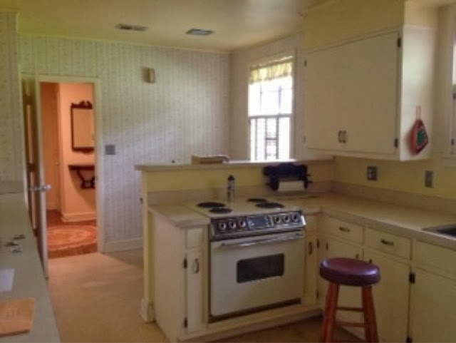
We didn't do too much in this room from a structural perspective except remove the peninsula. Knocking down the bulkheads helped to elevate the ceilings and open up the space all around. We removed the pantry and replaced it with floor-to-ceiling pantry cabinets for more functional storage.

Before:

After:


Before:
After:


Before:

After:

Some of my favorites in this room:
  • Dual fuel range - this sucker can turn out some yumminess in a jiffy
  • Bench storage & window seat - perfect spot for coffee and family meals
  • Open shelving - this is uber functional for us and we're surprisingly able to keep it tidy. We love the mix of old & new that this adds, too.
  • Marble counters - we languished over this decision a good bit, and we're ultimately really happy with it. More on that coming in a future post. 
  • The openness - we originally planned to have a small island in the middle of the kitchen, but we nixed that after living in the space a while. We love being able to dance during dinner prep (neighbors must love watching us) and Burke can spread out his toys to really make quite a mess.

Details:
  • Cabinets: Wellborn Shaker full overlay, glacier white
  • Countertops: honed Carrara marble, more on that search here
  • Shelves: Custom from reclaimed Douglas Fir
  • Hardware: Signature Hardware and My Knobs
  • Bench: Custom
  • Paint colors: see here
  • Lighting: Restoration Hardware (over sink) and Ballard Designs (over table)


Paint Colors

We labored over paint colors like most people do. Endless swatches painted on walls, way too many pints of test paint. It's a tough decision! We ended up going with one paint strip throughout the majority of the house, and I'm super pleased with how well the colors all work together yet still give enough interest throughout the home. It flows without being the same color. (the screen makes these look a bit more yellowy than they truly are...so be sure to test for yourself.)


SW 7042: Shoji White (a great creamy warm white)
Guest Bedroom
Guest Closet


SW 7043: Worldly Gray (this is a great warm greige without green or blue tones. sometimes it looks beige, other times more gray)
Hall
Master Closet
Laundry
Hall Closet

SW 7044: Amazing Gray (a slightly more saturated hue from the halls, kitchen, etc. Warm greige without weird undertones and a perfect neutral base.)
Master Bedroom
B's Bedroom & Closet


SW 7048: Urbane Bronze (love the pop this gives)


SW 6244: Naval (a solid navy without being too dark or too blue)
Guest Bath
Dining (above rail)

SW 7008: Alabaster (a fave white that isn't too stark or yellow or pink or anything. We've used it multiple times)
Trim throughout house

SW 6990: Caviar

SW 6204: Sea Salt (this is so pretty with the Carrara marble floors, counters, and shower tile!!!)
Master Bath